


WHY IS IT IMPORTANT TO MAKE YOUR EMAILS MOBILE-RESPONSIVE?
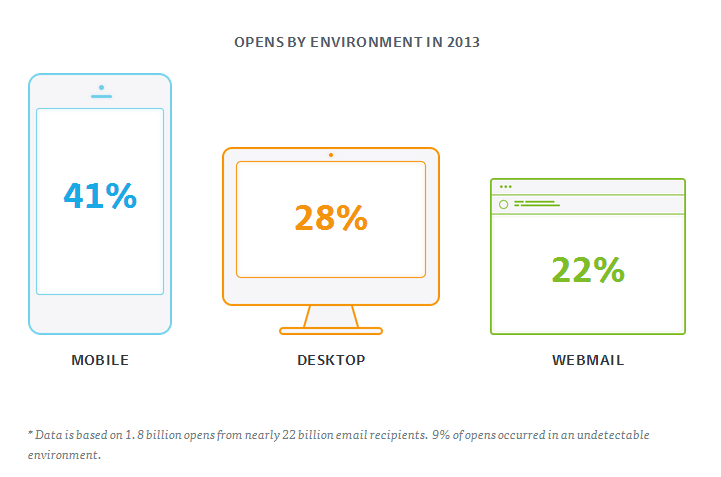
After analysing 6 million email campaigns, Campaign Monitor reported that back in 2013, 41% of emails were opened on mobile devices and only 28% were opened on desktop. Times have moved on since 2013 and mobile now dominates in an even bigger way. In general, users will initially glance over an email on their phone and if they are interested they will use a desktop to look into it further.
The main issue with making emailers responsive is that there are so many different types of phones available with different screen sizes and capacities. One size does not fit all, which creates problems for marketers. These problems include small fonts, narrow columns and broken layouts.
HERE ARE SEVERAL TIPS TO MAKE SURE YOUR EMAILS ARE RESPONSIVE
- Always design mobile first – There is a huge difference between the way emails are displayed on desktop and mobile. By designing your emailer for mobile firs, it not only helps you to keep the message simple but also means you will think about whether the content is readable and easy to navigate on a smaller screen.
- Single column layouts work best – This is because they can stack elegantly rather than being stretched or squished. For best results ensure your layouts are no wider than 500 to 600 pixels. This will mean that if the email does fall apart it will do so more gracefully.
- Links and buttons – These should have a minimum target area of 44×44 pixels to make sure that it’s clickable on a small screen.
- Keep your message concise – Place all important elements at the beginning of the email. We are an extremely time-poor society so we don’t want to be scrolling for days to get to the point of the email.
- Think about your font – Is the text large enough to make it readable on the small screen? Are your conversion points visible and obvious to click?
- Customer Journey – Very few marketing campaigns stop at the emailer. We are most often asked to click through to another page to finish an action. Therefore, you need to think about how your landing page looks and works as well as your email. We may take the time to view an email on more than one device but when it comes to landing pages we are less likely to and this can increase bounce rates. Unfortunately, we are fairly unforgiving, so if something doesn’t work instantly we have no time for it.
- Think about imagery – Use images thoughtfully throughout the email as they can stretch and distort when resized. Try to stay away from pictures of people as the crop on images like these matter. If a head is cut off it will ruin the overall effect of your emailer. Instead use images such as patterns, landscapes or repeated squares that are not reliant on being one size. It then doesn’t matter where the image is cropped.
- Test – The key to success is to test your emailer on different devices before you send it out to check that it doesn’t break and that all the links and click-throughs work. You will then know whether your emailer is responsive.