A logo is one of the most important considerations for any brand; it functions not only as an easy way for people to identify brands, but it also dictates how brands will be perceived and remembered. Consumers will decide on your brand within literally the blink of an eye. To make sure your logo is making the right impression, just follow these 5 simple steps.
 Simplicity – KISS – Keep it simple, stupid! Simplicity is a staple for logo development. Simple logos allow for easy recognition, and they also allow for the logo to be memorable as well as versatile. Don’t underestimate the complexity in designing a simple and effective logo; Facebook spent over 250 design hours developing the “Like” icon. A perfect example of a simple logo is Nike with their timeless swoosh:
 Memorable – What is the point of a logo if it’s not memorable? This is one of the most important considerations when designing a logo; after all, you need customers to remember who you are for them to buy from you. An effective logo will utilise the simplicity principle to become memorable. If the name of the brand can be communicated effectively within the logo, this allows for optimum brand retention. This trick is cleverly executed by one of the biggest names out there, Apple:
 Timeless – A true testament to a great logo is whether it stands the test of time. A great example of this is the Coca-Cola logo, standing strong since 1885 to the present day without so much of a tweak. It’s always tempting for a start-up or a brand refresh to deliver a logo that is ultra current without a great deal of thought for longevity. It’s vital to consider longevity during the logo design process if you’re looking for long-term success.
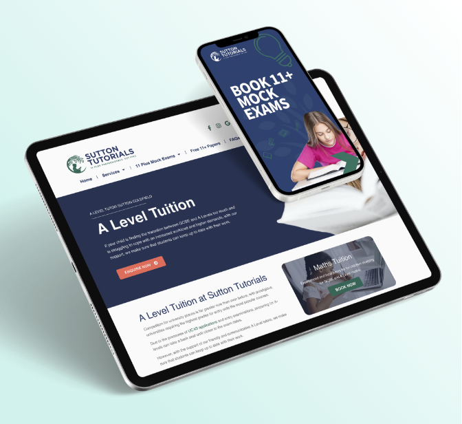
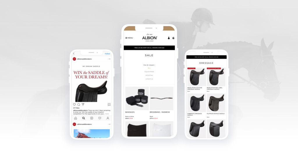
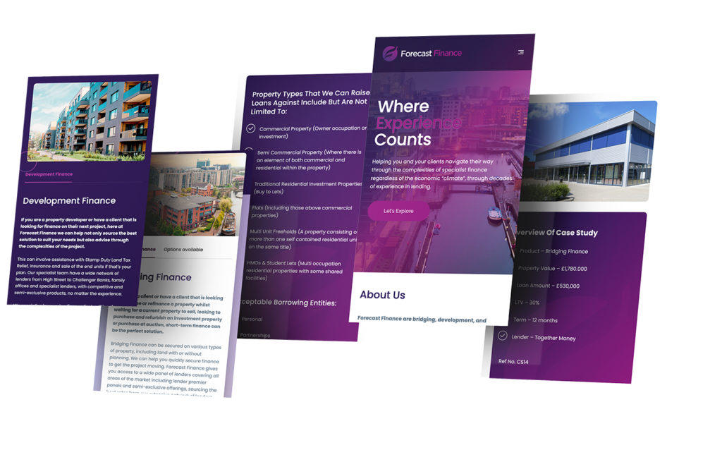
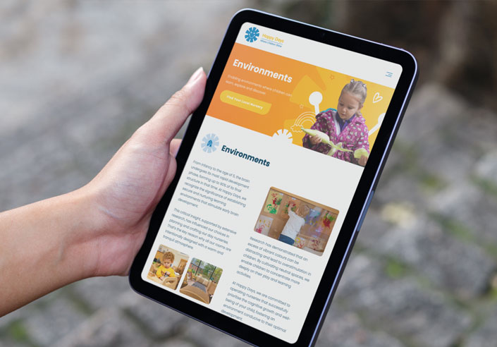
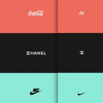 Versatile – When designing a logo, there are many things to be considered, one of these is how your logo will look when the size is altered and when it appears on different platforms. Logos no longer just appear on shop fronts or products, they now appear on computers, tablets and even mobile screens, creating a need for them to become smaller and smaller. An effective logo should be designed with many media in mind. Depending on where or on what the logo is displayed, it can be shown in full with a brand name on a billboard or scaled right down to just a small logo on the phone in your hand.
 Appropriate – Another temptation when designing a logo is to make it so that it appeals to many audiences; however, brands with focused logos tend to see more success in both the short and long term. Using your logo as a tool for your target audience to interact with you is key, and choosing colours and styles that resonate with your target audience is a great way to do this effectively.
The world of logo design is a tricky one; getting it right the first time is key, and a one-size-fits-all approach no longer works given all the channels available to customers. Head to our portfolio to check out some of the logos we’ve worked on.


