


SO, WHAT’S CHANGED?
Logo
Instagram have updated its brand image with a new icon. The old iconic Polaroid has been ditched for a new purple and orange logo.
Taking inspiration from the previous design, Instagram have had a freshen up. Still in the form of a camera, the gradient colour format and the simplistic style give the app a clean and fresh look and feel.
Instagram said the new design reflected how the app, bought by Facebook for $1 billion four years ago, had transformed since it was created.
The move to the new logo has been met with mixed emotions, but Instagram assure us that as the app has changed from one where users uploaded photos to make them look more retro, to the social phenomenon it is today, they too have had to evolve.
The App
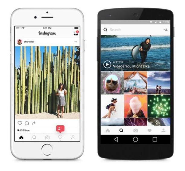
The inside of the app has also had a redesign, although the navigation and usage remains the same, there is now a new black and white design for backgrounds, icons and menus to make all those snaps really stand out and put a lot more emphasis on your photos and videos – as it should be right?
There are also some new filter options that users can use for their videos and photos! The old favourites, such as Valencia and Juno, are still there, but we are loving the additions. All you need to do is click the manage button, and there is a whole list to choose from.
Supporting Apps
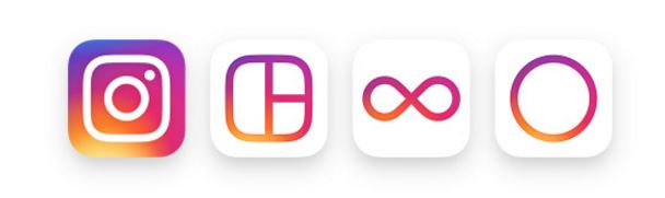
Instagram have also updated the icons for their other supporting apps, including Boomerang and Layout. This has created a consistent brand identity across the Instagram family.
WHAT DO WE THINK?
The EDGE Team have mixed views on the new Instagram branding launch.
Although the brand’s updated look is a big change from the previous, vintage-style Polaroid icon, we think that we will learn to love the new icon and its vibrant colours. However, we do feel that Instagram may have taken its inspiration from PowerPoint, using a gradient we have all seen and probably used in our presentations!
We think that the updated platform has a bit of a feminine look and feel, due to both its icon colour (using pink, purple, yellow and orange gradients) as well as the chic, clean-cut black and white colour scheme.
Some of us also think the changes make the app look much tidier, and maybe even corporate. It has a more professional feel, as we all become more professional in our photography skills!
The choice of new filters is also a big plus to the platform’s update. Although Instagram hasn’t changed the way you navigate around the app, it has added a whole range of photo and video filters for us to experiment with. Hours of fun, and we will be playing with the new filters for weeks! How will we ever choose now?
The Instagram community has evolved, grown and become even more diverse over the last 5 years, hence the reason for the updated look and feel. With over 80 million filtered photos and videos being shared daily, Instagram’s new and professional feel has come along just in time! And overall, EDGE think the change is healthy and we are all going to have to embrace the update, and for some of us who don’t instantly love it, we will learn to. Change is good!