In this article, we’ll talk about Pepsi’s brand evolution and how it’s branding developed from 1898 to it’s most recent change in 2023:
THE EARLY DAYS OF THE PEPSI BRAND
Founded by Caleb Bradham in the 1890s, Pepsi is now one of the biggest soft drink companies in the world. Originally named Brad’s drink, the name quickly changed to Pepsi-Cola, visible in the first logo in 1898, striking a distinct resemblance to Coca-Cola’s 1885 logo.
After originally being named Brad’s drink, the name quickly changed to Pepsi-Cola, so that they could market the product as a ‘healthy’ drink that featured the pepsin enzyme, which helps with digestion.
The new name was visible in the first logo in 1898, striking a distinct resemblance to Coca-Cola’s 1885 logo. It was one of several custom-designed logos by Bradham as Pepsi’s reputation continued to grow.
In 1933, Pepsi was bought by Loft Inc., leading to bottle sizes changing from 6oz to 12oz along with the addition of the tagline – Refreshing and Healthful.
However, the breakthrough into how we see the Pepsi logo today came about through the CEO of Pepsi in the 1940s, Walter Mack.
A new bottle design brought the idea of the crown featuring the logo. The ‘Pepsi globe’ we know today was instilled through Pepsi’s support of the US in their efforts in WWII. The patriotic sense of red, white and blue became hugely popular, and pride in this connotation developed into the 1950/1962 logos.
THE LOGO EVOLUTION OF PEPSI
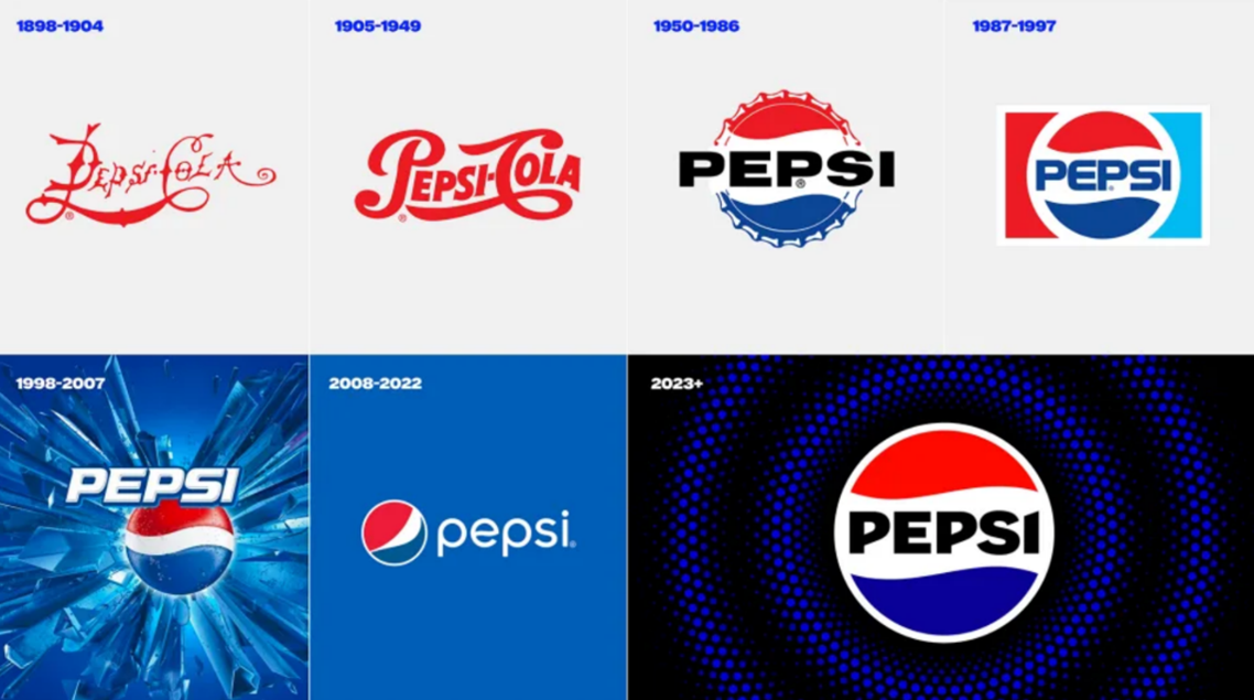
In 1962, the typeface changed to a bolder font while keeping the prominence of the bottle cap design.
The Pepsi brand started to experience a style shift, keeping the font simple, it went from a straightforward Sans Serif to a more futuristic font with rounded edges, whilst the logotype changed colours from the harsh black to match the blue energy of the lower wave.
Between 1973 and 2003, the logo adopted an almost flag-like design, developing through the decades in similar formats but contrasting design styles, perhaps due to changes in techniques and technological advances.
By the early 00s, Pepsi had removed all text and banners, solely concentrating on the updated bottle cap icon, also known as the globe. It is internationally recognised as a leading global brand and is synonymous with the values that form the foundation of the business.
BRANDING FOR THE DIGITAL AGE
In 2008, the Pepsi logo needed a refresh to meet the demands of the digital age. Designed by the Arnell Group, the logo was flattened and simplified.
A new font was created by Gerard Huerta with the ‘e’ reflecting the iconic Pepsi wave, and the iconic globe lost its established symmetrical waves in favour of a new, edgier look.
The changes weren’t as popular as expected, with some labelling it cheap and lazy. However, Pepsi stuck with the new look, feeling that the logo embodied the fun, energetic brand of youth.
A tweak shifted the logo to one with no outline around the globe. The overall branding was ideal for modern platforms and packaging. Easy to read and represented Pepsi’s brand elements.
It was accompanied by a lowercase sans-serif font, which helped it take on a fresher and more relevant look, designed to target younger generations, which has been something Pepsi has always tried to focus on.
A FRESH LOOK FOR PEPSI’S 125TH ANNIVERSARY
At the end of March, Pepsi announced the first update to its branding in 14 years.
The design is a throwback to the brand’s 1987-1997 logo, which also featured the Pepsi brand name in a bold typeface cradled within its iconic red and blue circle.
Pepsi says it has been specifically designed to introduce more movement and animation, allowing it to stand out and appeal more in an increasingly digital world.
Soft drink companies have been increasingly focusing on their zero-sugar offering and the brand refresh with a new colour palette that includes the colour black. This has taken aspects of the branding for its Pepsi Max range to highlight its continued focus on zero-sugar products.
Their new visual identity will be rolled out in North America in autumn, coinciding with the brand’s 125th anniversary, before being rolled out globally in 2024.
LEARN ABOUT THE EVOLUTION OF GLOBAL BRANDS
At EDGE Creative, we focus on helping businesses and organisations enhance their brand and create an identity that connects with their audience.
Part of this involves us keeping up to date with the latest developments in the world of branding, including popular trends and branding updates from household names, including how brands use logos, colours, typography and more to enhance their identity.
Read what our experts learnt about the brand evolution of other household names such as Canon, Nike and Volkswagen.
You can also book a free consultation with the team at our creative agency in Sutton Coldfield and learn how we can help take your brand identity to the next level.


