Why Brand Development is Crucial to Your SME Success

SME’s – they’re the lifeblood of the UK’s business scene. With over 5.7 million registered as of late 2018, it’s not surprising that 30% of businesses fail during their first two years. Five years down the line, this figure jumps to 50%.

With this in mind, how can you ensure your business stays strong, powerful and above the competition? Brand.

1. BRANDING IMPROVES RECOGNITION

How many logos do you come across during a day? Chances are, the number is pretty high. Even if you were to look around right now, you’ll likely spot a good few logos just on your first glance. If you want to attract attention, a memorable and well-designed logo is the best place to start.

However, a great brand goes far beyond a memorable logo. We all know that logos are important; they need to be instantly recognisable, convey your brand’s identity, and stand out across your entire marketing mix. Going “beyond” and making your brand truly recognisable is weaving these factors through absolutely everything you do, because if you want your brand to be recognisable, it must first be consistent.

Think: if your brand were a person, who would they be? What would they wear? How would they talk? What are their beliefs, goals and dreams? Before considering how your brand is going to be represented, you’ll need a clear set of guidelines describing your brand’s identity and personality, and exactly how you’re going to express this.

2. BRANDING GENERATES NEW LEADS

It’s hard to sell to people if they don’t know you exist in the first place. First impressions matter, and your brand is the first thing a potential customer will use to deduce if they want, need or trust your business. Your business might tick all their boxes, but does your brand tell them that?

Having a solid brand strategy will push you closer to new business, helping to bring in relevant leads who are ready to convert into customers. Brand awareness through channels such as social media and search engines could help customers to not only find you in the first place, but also understand that your brand is providing something they want.

Not only can branding make or break your success at the top of the marketing funnel, but branding can also influence customer loyalty and encourage repeat customers. If your brand becomes a familiar face for previous customers, consistency with your message, ethos and customer experience can help them choose you time and time again.

As well as making your brand consistent and recognisable, you also need to consider how it’s going to grab attention from potential customers. Your brand needs to be heard above the noise, but that doesn’t necessarily mean shouting louder. You just need to say something different.

3. BRANDING INSPIRES EMPLOYEES

Don’t be shallow – your brand’s true beauty comes from within. It’s essential that your brand has substance and incorporates a business mission.

Your business mission refers to your business’s purpose, ethos and values, and shouts out loud about how and why your company is different. When employees understand this and feel that they can relate to your mission, they are likely to feel the same pride and work in the same direction to achieve your business goals.

This can impact productivity and customer satisfaction. According to Korn Ferry’s Executive Survey, 70% of business executives say embracing the company mission boosts employee productivity to a great extent.’

Not only will a strong brand mission give prospective candidates a clear view of who you are as a business, but you’ll also show potential clients what your business stands for and influence their decision to use your products or services.

EDGE CREATIVE

EDGE Creative have extensive experience in brand building and storytelling for SME’s across a huge range of industries, including financial planning provider Ernest Grant, accessibility solutions provider Able Access UK, and fresh food supplier Tasty Chicken. One client we’re particularly proud of is Rudds Wellies, which came to us as a brand-new start-up business in 2016.

Having a strong brand has been vital to their success. We were tasked with creating the brand from scratch, incorporating the right look and feel to project the brand values and appeal to both consumers and funders.

Rachel Rudd, who is the founder of Rudds Wellies, said that after researching and developing their product for “nearly 2 years” before it came to market, they were “very nervous about finding a creative agency” that could take care of their product and “brand it effectively”.

I need not have worried,” said Rachel. “EDGE Creative have an amazing ability to understand what you need and create amazing imagery and content. They have been with me every step of the way, from logo and packaging design to holding my hand during presentations.”

Even when you’re not sure what you need, EDGE offer amazing expertise and options to give your business a brand it deserves.”

Find out more about how EDGE Creative can support you and your brand by calling 0121 355 8092 or emailing info@edge-creative.com.

References:

Increase Engagement on Your Website Through Animated Content

A great way to deliver a dynamic and impactful message on your website is to incorporate animated videos. Animated videos have the potential to work with you to create a visually appealing website that will engage with your audience on multiple devices. For example, we created an animated GIF for our client, Midlands LTA and their Spooktacular campaign. The GIF utilised motion and visual effects suited for the theme and target audience, and was posted across social media and helping our client reach users across desktop and mobile.

According to research conducted by Small Business Trends, companies using video enjoy 41% more web traffic from search than non-users. This, as well as an ever-increasing focus on video content within marketing in recent years, is why you should be paying attention to what animated videos can do for your business via digital channels. This focus on video and animation is important because you will be able to quickly grasp your audience’s attention and enable them to share your content across multiple devices and platforms.

WHERE DO I BEGIN?

You’ve received visitors to your website, but how do you keep them there? There is no question that movement attracts attention. So to take advantage of this, you can incorporate animation via videos, GIFs, and illustrations across your website to explain, inform and act as calls to action for your audience. You can also incorporate sound effects, music and voice-overs to add extra information and excitement.

We created an animated GIF for The Holistic Boot Camp to raise brand awareness and showcase their forthcoming holistic retreat, revealing the beautiful beach location, fitness activities and beauty treatments. The GIF was posted across social media to help our client reach users across devices and encourage shares and engagement.

WHY SHOULD I USE ANIMATED CONTENT?

Animated content such as GIFs, vlogs and explainer videos is a great way to create an emotional connection with your visitors, explaining ideas and conveying messages easily and in a fun and friendly way. This is backed up by market research, for example, HubSpot, Video Brewery and Switch Video collected the 50 best explainer videos, and out of these, 86% were animated.

Animated content can help to give clarity to complex information, making it more comprehensible to those who may speak a different language, younger audiences or people who may be new to the topic at hand, for example. Another benefit of animated content is that it can help you convey information quickly, as you may only have a few seconds to grab your visitor’s attention. Therefore, they have mass appeal that can allow you to connect with audiences across the world and capture their attention from the first click. For example, Dropbox added an animated explainer video to their homepage and saw a massive 10 million new customers and a £35 million increase in revenue.

WHAT SHOULD I KEEP IN MIND?

As always, it’s important to begin with the core message you want to convey and the impression you’d like to leave on your audience, and then build your content from there.

It is important to understand that animated content must serve a purpose. It should firstly have a practical function for your target audience and secondly reflect the brand personality of your website, but remember, don’t overdo it – a website cluttered with animation that has no meaning may lose you visitors – it needs long-term relevancy!

HOW CAN EDGE HELP?

EDGE Creative have worked with several clients to produce high-quality and engaging animated content that incorporates movement, visual effects and brand identity to promote businesses and events in a variety of industries. We can produce animated GIFs, videos, vlogs, explainer videos and much more to explain, inform and promote across multiple devices and platforms.

Web animation is a design trend that EDGE Creative will be giving even more attention to this year. Our animation expert, John, has had a very busy 2018 so far, working on multiple animation projects as well as the redesign of our website, with an improved user journey and additional animated content!

Why not add an EDGE to your website? Call us on 0121 355 8092 or email us at info@edge-creative.com to talk about animated content and how it can work for your brand.

Creating the Perfect Presentation

Firstly, a few aspects are essential to keep in mind when planning out your pitch. Putting well-designed content high on the list allows you to think about conceptual thinking, presentation, and user experience. Design and content are important for getting your message across in a concise, clear way. As part of this process, it’s a good idea to plan out the structure of your content, remember to keep it simple and only summarise key points.

A well-designed presentation is a powerful tool. It can give your presentation personality and can demonstrate a level of creative and conceptual thinking that reflects the way you approach businesses. Attention to design is paramount for any presentation! We would recommend taking a design-led approach, using it as a visual tool to boost your pitch.

If you want to use the presentation as an aid, you don’t want to display too much information. Only highlight the essentials, simplify it to numbers and keywords. When you give your presentation, you want it to be engaging and interactive, so you might consider having a quiz at the end of your presentation and offering a prize if it fits your brand and pitch.

This might be obvious advice, but remember to be prepared, practice your presentation in front of someone, talk it through aloud and think about any questions you might get asked at the end of your pitch.

To accompany the presentation, you might want to think about a handout of the presentation with your contact details you could give out after so that your audience can follow up with you or find out more.

HERE ARE SOME DESIGN TOP TIPS

  1. Ensure your presentation reflects your brand, design, and message.
  2. From a design perspective, you could use your main branding colour to add a touch of personality.
  3. When planning your presentation, consider that your audience doesn’t have much time, so you want to get your message across quickly and effectively, without taking anything away from the purpose of the presentation.
  4. For example, you can accentuate numbers with charts.
  5. Add personality to posts by using icons to reduce and simplify the text.
  6. Icons can work like headings or subheadings. They allow your audience to scan content for the key points.
  7. Use compelling imagery, whether they are stock images or your own. Using bold, striking imagery can add personality and establish your brand. The other benefit to using imagery is that it can break up the text.

Top tip of the day: if you’re sending your presentation out, save it as a PDF so that the formatting, fonts, and imagery remain intact.

If you’d like us to plan, design, copywrite and create a presentation, talk to one of the team today for more information. Call 0121 355 8092 or email info@edge-creative.com.

Why Print is Still an Essential Part of Your Marketing!

In a world that is all about digital, you might be thinking, Is print crucial to reach my audience? The answer is yes. For example, if you want people to find you, you’ll need a sign outside the premises, along with menus, flyers, promotional brochures, etc. Print is all around, and you might not know it.

So, here’s a list of reasons why print is crucial:

1. BRANDING 101

Does your brand stand out? Are you getting your name out there? These are the types of questions you need to ask yourself about your brand.

People are more likely to go with a brand they recognise, and one of the only ways to get your brand recognised physically is to put it out there into the public domain. This can be done with posters, mugs, flyers, billboards, signs, print advertising, etc.

2. IS YOUR BRAND RECOGNISABLE?

The next hurdle is getting your brand seen and recognised. This can be achieved through having a set of brand colours, typefaces, and a logo. Having these elements in place means your brand flows from offline to online seamlessly.

Consistency is the key to a brand’s success. As part of being seen, you need to ensure that the little things are correct. For example, if your poster is getting printed, you need to ensure it is printed to the right size, that it’s legible for the public to understand and that it has been proofread. Attention to detail is paramount, especially as once something is printed, mistakes can be costly.

3. CREATING ENGAGEMENT

With any marketing, the primary goal is engagement. With print being a trusted form of marketing, this may be easier to obtain. To gain engagement through print, you need to keep in mind the following factors: your printed material needs to be attention-grabbing, it needs to represent your brand effortlessly, and it needs to be valuable to the target audience.

4. REACHING THE RIGHT SEGMENTS

With print, you can reach the right marketing segment by simply knowing where your audience is. Taking the time to understand your audience can help you to reach them effectively with targeted print marketing.

5. REACHING OUT TO YOUR AUDIENCE

Niche marketing can be difficult, as you are not marketing to the masses, and you need to make your content valuable, so your audience will pay attention. In addition to this, you need to find out where your product or service will work, what your competitors are doing and where they are advertising, to gauge the best way to get your message out on the right channels.

It’s important to get your brand out there on as many channels as possible. Print allows you to get your message heard offline and create synergy with your online marketing activity.

If you’d like to find out more about how print marketing can help your brand reach new heights, get in touch with one of the team today at info@edge-creative.com.

5 UK Essentials for a Search Engine Optimised Website

The term user experience (UX) is about ensuring users find value in what you are providing to them. Giving users a comprehensive and simple journey through your site, being able to navigate your website well without unnecessary steps to get to their end goal.

To put this into context, all users visiting a website are looking for information or a solution to a problem. They want to find the information or product quickly and simply; if this is not achieved, they will leave without converting.

Websites are the multifaceted shop window of your business. They serve to build lasting relationships and sell your products or services, but many miss the mark.

SEO works to draw prospective clients to your website via search engines as you climb the rankings. UX helps users to locate the information they need once on your website and is the catalyst for building and maintaining a relationship with prospective clients.

Both are often seen as separate ways to solve separate problems, but that is not the case. Without SEO, your UX is redundant and vice versa. Here are the 5 UX best practices for developing your SEO:

RESPONSIVE AND MOBILE-OPTIMISATION

In a world that is becoming increasingly mobile-centred, it’s more important than ever to ensure that your website functions as well on mobile devices as it does on desktops.  To put this into perspective, using the data from the Cisco Visual Networking Index, “global mobile devices and connections in 2016 grew to 8.0 billion, up from 7.6 billion in 2015.” With an increase in mobile traffic of 63% in 2016.

If your website doesn’t have mobile users in mind, they are likely to leave and return to their search query. If you’re not sure your website is optimised, you can test it at Nibbler or GTmetrix to give you a starting point.

IMPROVED WEBSITE PERFORMANCE

It’s no secret that Google considers page speed in the ranking of websites, as algorithms punish slow websites. Page speed is a key factor in all aspects of UX.

According to a report conducted by Google Tools:

“Mobile sites that load in five seconds earn up to two times more mobile ad revenue than sites that load in 19 seconds”

Improving your page speed yields dividends when it comes to user experience and search rankings. To access your web page speed, you can obtain data from Google Analytics within the Behaviour tab and using Google’s PageSpeed Insights tool.

CONTENT IS KING

Whilst SEO boosts website visibility, the on-page content engages and informs the audience in a way that supports the user experience. Google’s Panda algorithm oversees punishing sites that do not add value to the user experience, specifically content-thin sites or sites with low-quality content. To ensure your content follows Panda’s algorithm, putting an information architecture in place is a good starting point. The information architecture is the science of organising and structuring the content of a website in a logical order, which is owned as a Symantec structure. The current trend is to centre design around the user.

If you’re not sure whether your website is hitting the mark, ask your customers or clients. For example, send them an email asking them how long it takes them to find a snippet of information or a specific product. See what the results are; it might surprise you.

USER-FRIENDLY NAVIGATION

Webmasters and businesses often overcomplicate the navigation of their website, which not only confuses those arriving at their website but also search engines as well.

Users can navigate through your website quickly and efficiently, which encourages conversions and supports the overall user experience. Test your website’s navigation by comparing it to the user-friendly best practices from Thought Co.

USE IMAGES TO SUPPORT CONTENT

Imagery and graphics are certainly important from an aesthetic and branding point of view, but they have functional properties in that they contribute to the UX and SEO as well.

Without imagery, content can lack engagement and necessary visuals to inform the user further. This is detrimental to the UX as well as SEO in that you can be found in search engines for your images if they are optimised for this with alt-text.

To test the readability of your site, you can use apps such as Readable and WebPageFX.

CONCLUSION

SEO leads to increased traffic to your site and helps it attain a higher position on SERPs; however, it’s UX that will determine whether the traffic can be sustained and converted into customers.

SEO and UX work together to direct qualified traffic to your website and convert it. Webmasters wanting to improve website performance in all aspects should focus on the two and adhere to the above best practices.

If you need help with your website or are looking for help to design and build your website, look no further than our development team. Give us a call on 0121 355 8092 or email us at info@edge-creative.com.

Love Your Logo – 5 Golden Rules for Creating a Great Logo

A logo is one of the most important considerations for any brand; it functions not only as an easy way for people to identify brands, but it also dictates how brands will be perceived and remembered. Consumers will decide on your brand within literally the blink of an eye.  To make sure your logo is making the right impression, just follow these 5 simple steps.

nike logoSimplicity – KISS – Keep it simple, stupid! Simplicity is a staple for logo development. Simple logos allow for easy recognition, and they also allow for the logo to be memorable as well as versatile. Don’t underestimate the complexity in designing a simple and effective logo; Facebook spent over 250 design hours developing the “Like” icon. A perfect example of a simple logo is Nike with their timeless swoosh:

apple logoMemorable – What is the point of a logo if it’s not memorable? This is one of the most important considerations when designing a logo; after all, you need customers to remember who you are for them to buy from you. An effective logo will utilise the simplicity principle to become memorable. If the name of the brand can be communicated effectively within the logo, this allows for optimum brand retention. This trick is cleverly executed by one of the biggest names out there, Apple:

Coca Cola logoTimeless – A true testament to a great logo is whether it stands the test of time. A great example of this is the Coca-Cola logo, standing strong since 1885 to the present day without so much of a tweak. It’s always tempting for a start-up or a brand refresh to deliver a logo that is ultra current without a great deal of thought for longevity.  It’s vital to consider longevity during the logo design process if you’re looking for long-term success.

Different logo stylesVersatile – When designing a logo, there are many things to be considered, one of these is how your logo will look when the size is altered and when it appears on different platforms. Logos no longer just appear on shop fronts or products, they now appear on computers, tablets and even mobile screens, creating a need for them to become smaller and smaller. An effective logo should be designed with many media in mind. Depending on where or on what the logo is displayed, it can be shown in full with a brand name on a billboard or scaled right down to just a small logo on the phone in your hand.

Barclays logoAppropriate – Another temptation when designing a logo is to make it so that it appeals to many audiences; however, brands with focused logos tend to see more success in both the short and long term. Using your logo as a tool for your target audience to interact with you is key, and choosing colours and styles that resonate with your target audience is a great way to do this effectively.

The world of logo design is a tricky one; getting it right the first time is key, and a one-size-fits-all approach no longer works given all the channels available to customers. Head to our portfolio to check out some of the logos we’ve worked on.

Brand Awareness: It’s All About Ambition

WHAT IS BRAND AWARENESS?

The likelihood that consumers recognise the existence and availability of a company’s product or service. Creating brand awareness is one of the key steps in promoting a business.

A brand should be a conduit for the relationship between the organisation it symbolises and the customers it serves, to develop; without this relationship, a brand will always fail.

Brand awareness is extremely important for the simple fact that if the customer doesn’t know about it, they’re not going to purchase it.

The less a product differentiates from its competition in a physical or functional sense, the more important it is that the brand values express emotive and intangible cues.
Therefore, a product that maintains the highest brand awareness of a superior offering will usually win the “battle of the sales”.


For Example…

In the energy beverage industry, very little separates one energy drink from the other in terms of their taste or perceived energy benefits.

Energy Drinks Supermarket

When we very naively assess the energy drinks market, what brand do you think of? Try it out in the office and see what’s most popular.

The iconic red and blue coloured can and the fierce red bulls at the locker-heads usually comes out on top. Your colleagues may even divulge deeper connotations of excitement, adrenaline or extreme sports?

If we think about it, the term Brand Awareness is pretty self-explanatory, but the means of customers becoming “brand-aware” is not so easy to achieve, especially as brands and society become more merged than ever before.

A very interesting article from Nicola Kemp at Marketing Magazine, on the six marketing lessons from Red Bull Stratos, discusses values all brands should seek to enforce to help build relationships.


Now, we don’t all have a multi-million pound marketing budget like Red Bull, and we sure-as hell don’t have a space shuttle, and if you do – touche, but the principles can most definitely be applied to any brand:

Develop a sense of purpose – It must be made clear to your customers what your brand offers

Do more than grow your bottom line – See everything you do as an investment in your brand, not just for now, but for the future

Think bigger than ROI – Remember the intangible benefits of your brand. Winning the hearts and minds of your customers will allow your business model to work a lot harder for you

Embrace creative marketing – Do something different and make a stand to break through the noise

Behaviour vs Brand Value – In the modern world of marketing, consumers seek a social etiquette more and more from brands; a way the brand can add value to their lives.
Consumers are researching, discussing and sharing more online than ever before; mobile-browsing to tweeting, blogging to vlogging, face-timing to snap-chatting.
It’s no longer a case of “build it and they will come”; consumers have become more sophisticated and now ask, “Why should I?”

Commit – If you don’t invest in your products and services, how do you expect your customers to?

With the rise of the digital age, the marketing spectrum is becoming more and more diverse, whether it’s crowdfunding, social media, mobile apps or viral videos, there are numerous ways to express your brand messages.
It’s important to consider these 6 underlying principles and strategise how your brand will communicate, more importantly, how you will make your customers aware of your messages.

“Not every brand has the inclination or budget to invest in something bigger than itself, but the best marketers should at least have the ambition to try.”  – Nicola Kemp


St.Georges Day – The Power of Symbolism

“Cry God for Harry, England and St George!”

William Shakespeare

On this day we celebrate the life of our patron, Saint of England and our pride in English heritage. Saint George’s national flag will be standing tall above Downing Street today as we are sitting down for our afternoon tea and complaining about it being too warm outside. Our pride in England has continually increased over the years and more than 73 per cent of us think that Saint George’s day should be made into a national holiday. Over the weekend events have been held all through England to celebrate what it is to be English and David Cameron has spoken out urging us to celebrate just as other nations in the United Kingdom do.

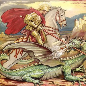
The legend of Saint George depicts a village tormented by an evil dragon that would gobble up sheep and children. To cut a long story short, Saint George rescued the Kings daughter from impending doom whilst bearing the sign of the cross and they all lived happily ever after – a perfectly English fairytale!

The red cross on a white background originated as an emblem in the middle ages for crusaders and then became the national flag of England during the 16th century. It is our most widely recognized symbol and as it is held high throughout England today in all of its simplicity, it reminds us of our history without saying a single word.

Branding doesn’t need to be complicated; anything as simple as a red cross can speak volumes.

When Do You Need to Rebrand?

This is an important question and one that should not be taken lightly.

Your brand is the essence of your business and a core communication vehicle for all your marketing messages. It should remain 100% consistent and be consistently used at every point of contact with your target audience.

Branding’ isn’t just a pretty symbol or a company name with fancy design; it’s far more than that. Some of the best brands are simple and placid.

It’s about building perceptions of your company that become embedded in your brand which, over a long-term strategy, build brand equity and improves your bottom line.

Read about the evolution of brand in the these modern cases: Pepsi, Volkswagen, Nike, Canon and Apple

”My business is too small to worry about a brand”

Wrong.
No business is ever too small, or too big for that matter. Think of branding as reputation. How will your business grow if customers don’t recognise you or have never heard of you?

A brand is a critical identification tool that presents information for your target audience to assimilate and, hopefully, recommend. Now without it, you’re just a person doing a job. If you want to grow, you should seek to be a person who represents a brand and all the hard work you devote to that job not only earns you revenue but is simultaneously developing your intangible assets; your brand.

‘Brands reside in the minds of consumers’
 

Perhaps your business is in a “comfortable” position? Do not rest on your laurels. Think. Will the company be “comfortable” in 10, 5, even a years time?

Any major change occurring now, or that may occur in the future, within your business’ environment must become explicit to your target audience in marketing messages. Otherwise the core communication channel of your business, the brand, will start to, one for a better word, go out of fashion.

Perhaps the business environment has changed and your company requires a different proposition?

Maybe there is greater impetus on service/product innovation – how will you communicate your methods in servicing this market?

Even the “big guys” get this wrong – Read the Microsoft vs Apple Case Study

Evaluate your brand

Here are 5 Important factors that raise questions about how “in-trend” your brand is:

  • Market differentiation – How does your brand/company differ against competitors? Does it at all?
  • Brand awareness – How well is your brand understood?
  • Associations and emotional attachments  – What is understood about your brand?
  • Consumer personality ­– Does your brand and marketing communications reflect your target audience accurately?
  • Improve relationship customer base – Can a tighter bond be created between consumer and brand? If so, why has this not been achieved?

Brand Evolution – Nike

Founded in 1964, Nike began its life as Blue Ribbon Sports and was originally a distributor of Onitsuka Tiger, a Japanese brand of trainers. In 1971, Blue Ribbon Sports ended its relationship with Onitsuka Tiger and went on to produce Nike, their athletic shoe. The 1971 logo used for the shoe was designed for just $35 and built the basis for a brand logo that would be globally recognised and remain relatively unchanged.

Named after the Greek goddess of victory, the success of the ‘Nike’ resulted in Blue Ribbon Sports renaming itself Nike in 1978. To enhance the name of this new brand, the text was pulled out of the logo to sit clearly on top of the Nike tick in a bolder typeface, perhaps a nod to the accomplishments of the brand to that point.

In 1985, the red box was introduced, making a visual statement in a market that was becoming increasingly competitive with rival brands. Through its consequent success and gaining recognition and reputation as a leading brand, the company name was dropped from the logo and the red colour was adopted, making it more simplistic and memorable and lending itself to use across all product ranges accordingly.

Coming tomorrow….. Brand Evolution – Volkswagen

If you missed yesterday’s Blog for Brand Evolution – Pepsi, click here!

Brand Evolution – Pepsi

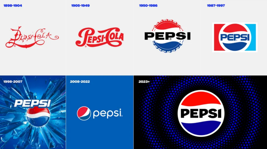
In this article, we’ll talk about Pepsi’s brand evolution and how it’s branding developed from 1898 to it’s most recent change in 2023:

THE EARLY DAYS OF THE PEPSI BRAND

Founded by Caleb Bradham in the 1890s, Pepsi is now one of the biggest soft drink companies in the world.  Originally named Brad’s drink, the name quickly changed to Pepsi-Cola, visible in the first logo in 1898, striking a distinct resemblance to Coca-Cola’s 1885 logo.

After originally being named Brad’s drink, the name quickly changed to Pepsi-Cola, so that they could market the product as a ‘healthy’ drink that featured the pepsin enzyme, which helps with digestion.

The new name was visible in the first logo in 1898, striking a distinct resemblance to Coca-Cola’s 1885 logo. It was one of several custom-designed logos by Bradham as Pepsi’s reputation continued to grow.

In 1933, Pepsi was bought by Loft Inc., leading to bottle sizes changing from 6oz to 12oz along with the addition of the tagline – Refreshing and Healthful.

However, the breakthrough into how we see the Pepsi logo today came about through the CEO of Pepsi in the 1940s, Walter Mack.

A new bottle design brought the idea of the crown featuring the logo. The ‘Pepsi globe’ we know today was instilled through Pepsi’s support of the US in their efforts in WWII. The patriotic sense of red, white and blue became hugely popular, and pride in this connotation developed into the 1950/1962 logos.

THE LOGO EVOLUTION OF PEPSI

In 1962, the typeface changed to a bolder font while keeping the prominence of the bottle cap design.

The Pepsi brand started to experience a style shift, keeping the font simple, it went from a straightforward Sans Serif to a more futuristic font with rounded edges, whilst the logotype changed colours from the harsh black to match the blue energy of the lower wave. 

Between 1973 and 2003, the logo adopted an almost flag-like design, developing through the decades in similar formats but contrasting design styles, perhaps due to changes in techniques and technological advances.

By the early 00s, Pepsi had removed all text and banners, solely concentrating on the updated bottle cap icon, also known as the globe. It is internationally recognised as a leading global brand and is synonymous with the values that form the foundation of the business.


BRANDING FOR THE DIGITAL AGE

In 2008, the Pepsi logo needed a refresh to meet the demands of the digital age. Designed by the Arnell Group, the logo was flattened and simplified.

A new font was created by Gerard Huerta with the ‘e’ reflecting the iconic Pepsi wave, and the iconic globe lost its established symmetrical waves in favour of a new, edgier look.

The changes weren’t as popular as expected, with some labelling it cheap and lazy. However, Pepsi stuck with the new look, feeling that the logo embodied the fun, energetic brand of youth.

A tweak shifted the logo to one with no outline around the globe. The overall branding was ideal for modern platforms and packaging. Easy to read and represented Pepsi’s brand elements.

It was accompanied by a lowercase sans-serif font, which helped it take on a fresher and more relevant look, designed to target younger generations, which has been something Pepsi has always tried to focus on.

A FRESH LOOK FOR PEPSI’S 125TH ANNIVERSARY

At the end of March, Pepsi announced the first update to its branding in 14 years.

The design is a throwback to the brand’s 1987-1997 logo, which also featured the Pepsi brand name in a bold typeface cradled within its iconic red and blue circle.

Pepsi says it has been specifically designed to introduce more movement and animation, allowing it to stand out and appeal more in an increasingly digital world.

Soft drink companies have been increasingly focusing on their zero-sugar offering and the brand refresh with a new colour palette that includes the colour black. This has taken aspects of the branding for its Pepsi Max range to highlight its continued focus on zero-sugar products.

Their new visual identity will be rolled out in North America in autumn, coinciding with the brand’s 125th anniversary, before being rolled out globally in 2024.

LEARN ABOUT THE EVOLUTION OF GLOBAL BRANDS

At EDGE Creative, we focus on helping businesses and organisations enhance their brand and create an identity that connects with their audience.

Part of this involves us keeping up to date with the latest developments in the world of branding, including popular trends and branding updates from household names, including how brands use logos, colours, typography and more to enhance their identity.

Read what our experts learnt about the brand evolution of other household names such as Canon, Nike and Volkswagen.

You can also book a free consultation with the team at our creative agency in Sutton Coldfield and learn how we can help take your brand identity to the next level.