Lisieux Trust

Lisieux social media management and social media design

Summary

Lisieux Trust are a provider of supported living and residential care services to adults with learning disabilities and autism. The Trust have 11 properties located around Sutton Coldfield and Erdington, 8 of which are dedicated to supported living while the other 3 focus on their residential care services.

Their focus as an organisation is on ensuring tenants and residents live happy, enriched lives, full of opportunity and choice.

The Task

EDGE were initially approached by Lisieux Trust in June 2022 to provide marketing support while their CEO and Marketing Manager were both on maternity leave.

We took control of their social media platforms, tasked with helping to grow their audience across four platforms – Facebook, Instagram, Twitter and LinkedIn, whilst promoting the work that Lisieux Trust does to help to enrich the lives of adults with learning disabilities or autism.

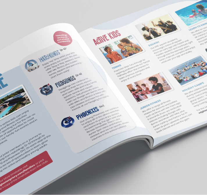
Alongside this, we also took charge of their monthly newsletter, in particular the design of their printed version as well as building and distributing the digital version that is sent via email.

Instagram social media management and social media design
LinkedIn social media design and social media management for Lisieux Trust
Lisieux Trust Facebook page management and design
Lisieux Trust Twitter page management and social media design

The Results

Using a tailored approach to their social media strategies, we identified the requirements of each of their platform’s audiences by looking at analytics and data available to us. This then helped us to determine the types of posts that would meet their audiences’ requirements but also meet the desires of each platforms’ algorithms.

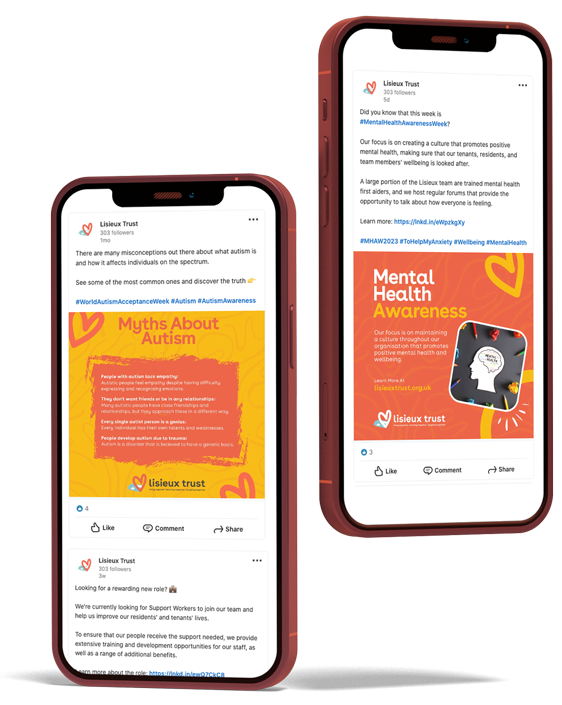
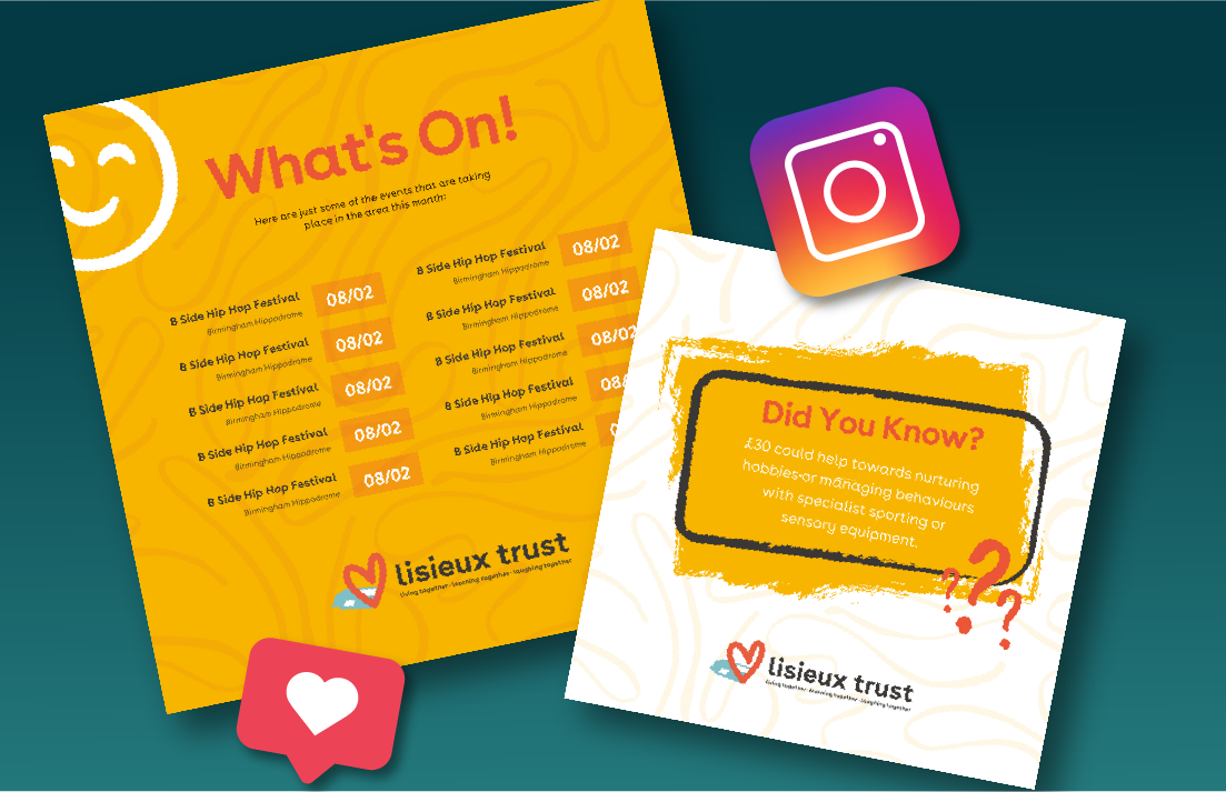
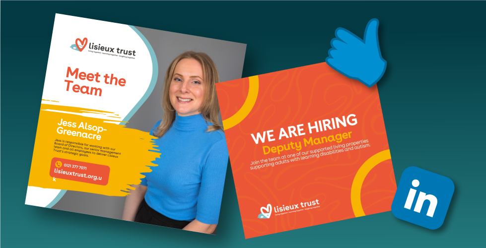
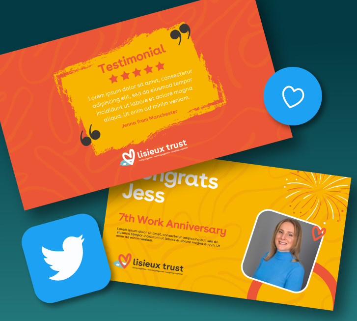
In line with the Trust’s own aims, our focus has been on showcasing the opportunities they provide to their tenants and residents, something we do through sharing the activities of everyone at the Trust in engaging image carousels, videos, reels and infographics.

Our design team showcased their creative talents by designing eye catching themes and templates that not only help the posts we create stand out on news feeds but also compliment the Lisieux Trust brand and identity.

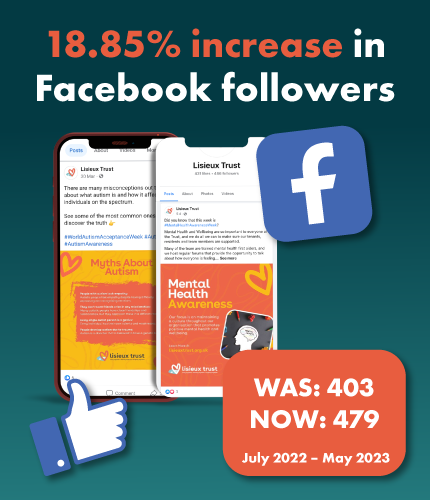
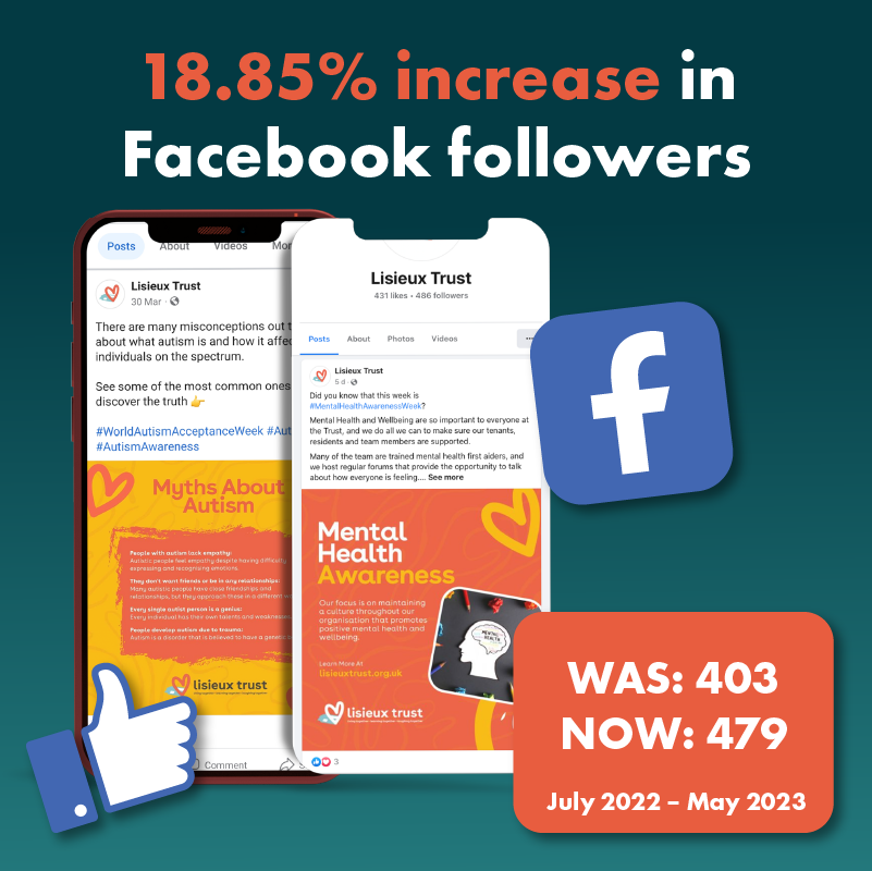
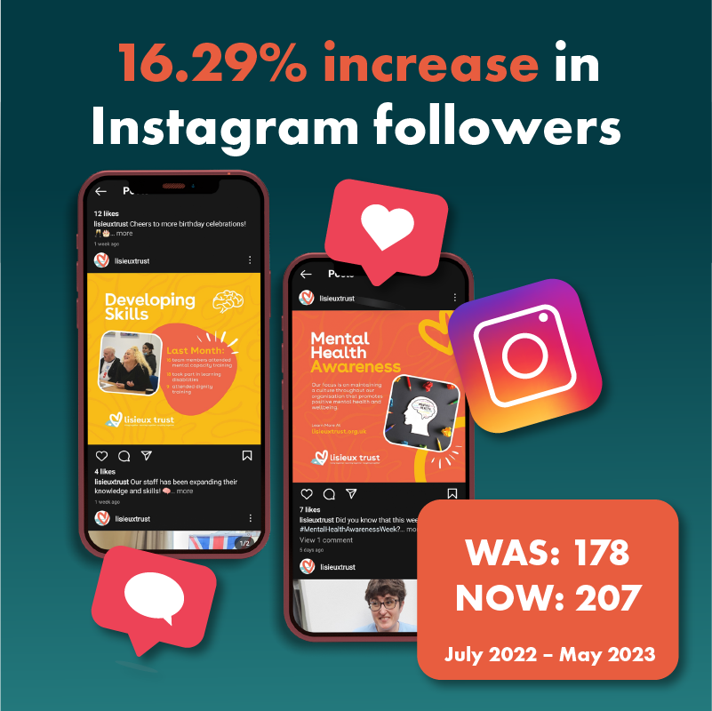
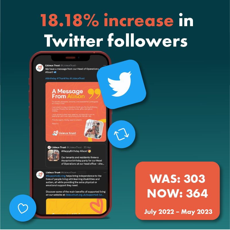
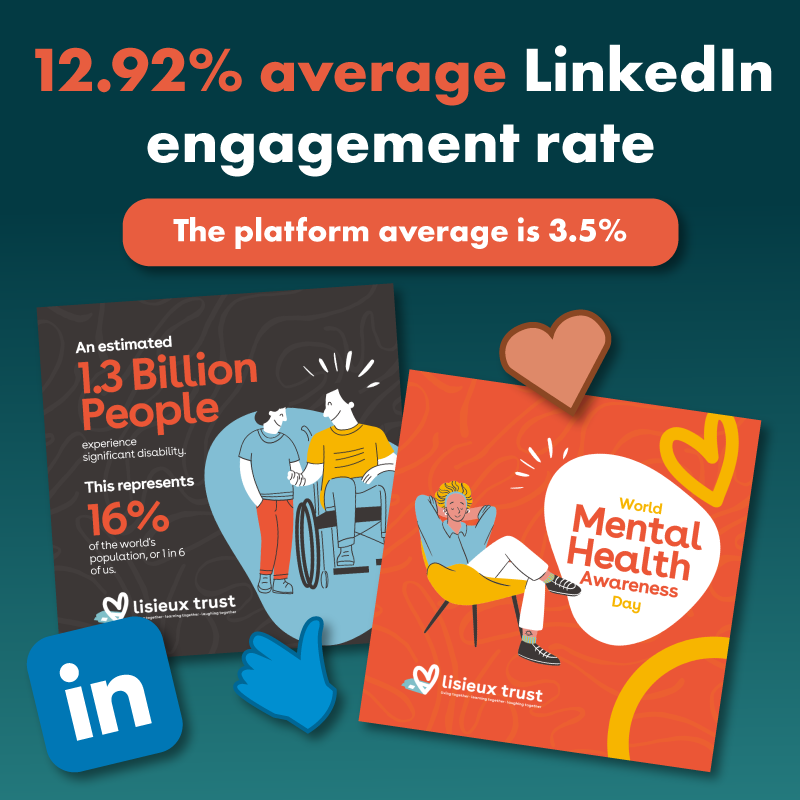
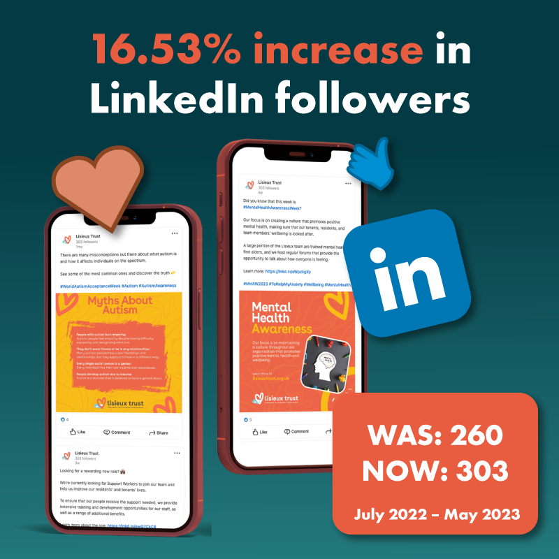
Since we took over, we have seen consistent growth on all their platforms in terms of followers. LinkedIn has grown by 16.53%, Facebook by 18.85%, Twitter by 18.18% and Instagram by 16.29%. Alongside this, post engagement has been sitting well above the industry average.

We will continue to review and tailor our approach to Lisieux Trust’s social content every month, identifying new approaches to engaging with their audience that will help continue to open them up to new audiences.

We are thrilled to work with Lisieux Trust on various marketing projects. Our social media strategy really resonated with their audience and helped them achieve impressive results. It was incredibly rewarding to see our work make a positive impact on their business.

Karen O’Donovan Client Director at EDGE Creative

What we can do for you

Book your free consultation

Are you ready to take your business to the next level? Drive traffic, increase leads and stimulate a positive business impact.

Book Now

Fidelis

Summary

Fidelis provide high-quality cleaning, facilities management and related property services. They are driven by their vision to be the market leader in world-class cleaning, providing the perfect lasting impression of a premises.

The Task

We were tasked to help Fidelis Group present an engaging pitch and proposal document of their services to a potential customer. A detailed audit of current marketing led us to create a strategic credentials document for the sale team, what we believe to be an essential tool for showcasing Fidelis in new business presentations. It was important to encompass a clear overview of the businesses capabilities and experience, whilst highlighting the benefits of becoming a Fidelis client.

The credentials document had to communicate Fidelis Groups’ brand values, expertise and first class service offering in an engaging and targeted manner. The document was to maintain the professional standard of Fidelis’ approach, keeping the target audience in mind at every stage of engagement.

The Results

We intentionally made the document simple in design yet effective in its delivery. We achieved this by using clearly branded sections, highlighting key points to focus on and increasing visual impact through creative direction such as contrasting colour panels, bullet points and a clean-cut, fresh appearance.

The document was also designed to be editable in-house for future presentations. We also made sure we included information about business processes and client management, with the aim to help the audience visualise being a Fidelis client.

The credentials document was a great success, as we helped Fidelis Group stand out from the competition, resulting in them securing a new business contact worth £200k. The client was delighted with the result, as it proved to be extremely effective marketing investment.

The attention to detail from EDGE meant that we secured a contract, helping the Fidelis Group to grow and develop. We are absolutely delighted by the creativity, hard work and seamless process that has been executed in this project. It is without a doubt an asset to our business.

Lloyd Ansermoz Marketing Director

What we can do for you

Book your free consultation

Are you ready to take your business to the next level? Drive traffic, increase leads and stimulate a positive business impact.

Book Now

Edgbaston Priory Club

Background for Edgbaston Priory Club showcasing marketing strategies
Woman at Edgbastion Priory Club swinging a tennis racket at a ball

Summary

Edgbaston Priory Club is a private sports club in the heart of Birmingham. The club has over 130 years of history and dates back to the very birth of lawn tennis. Set within historic grounds, the club boasts almost 15 acres of natural beauty just five miles from Birmingham’s dynamic city centre and offers members a variety of sports, lifestyle and wellness facilities – making it the perfect place to train, play, relax and unwind.

Our relationship with the club began in 2013, when we created characters for their Junior Tennis Open. Since then, we’ve worked with the business on multiple projects, including the recent launch of the family membership area. The club wanted to build the junior members area as a membership for families, to be an encompassing offer for all family members.

Blue background for Edgbaston Priory Club

The Task

The club sought to increase the involvement of families through the creation of a junior members area. To ensure we met their objectives, our brilliant team of designers set to work utilising core brand colours and themes to develop a junior members area full of bright, engaging characters representing different age brackets.

Building on the clubs’ signature phoenix logo, our designers crafted three junior members bands – Hatchlings (0-5), Fledglings (5-11) and Phoenixes (11+) to ensure that mascots were engaging and representative of each age bracket. Designed with the members in mind, the junior members area represents the abundance of sporting and wellness activities for children of all ages, as well as activities for parents of young children to join in with.

Logo design and mascot design for Edgbaston Priory Club on a mac computer
Advertising banner design for Edgbaston Priory Club
Woman playing tennis on a sunny day
The booklet cover design and booklet interior design for Edgbaston Priory club

The Results

The updated Edgbaston Priory Club junior members area reflects their position as a club for the whole family. The site has been built to cater to parents and children, through creches that enable parents to work out and relax knowing their children are well looked after, and with exciting characters to engage the younger members.

Graphic design plays a vital role in the marketing environment and creates a competitive edge for businesses. Our team of skilled designers built the junior members area with core brand colours in mind to effectively communicate the concept and ideas to the club’s target audience.

In addition to the website, our creatives designed graphics for timetables, flyers, posters, bags and more, to communicate and share the brand message. Our work led to a positive outcome for the client who delighted members with the new family area.

The booklet cover design and booklet interior design for Edgbaston Priory club

We were very happy with the work EDGE undertook for our eight years strategy document, especially the video produced in partnership with CMA. It has proved to be a great communication tool, sharing exactly what we wanted to communicate to our members about our future strategic direction and how we want them to feel about being a member of the club. The video seamlessly delivers the across the different media channels. We couldn’t be more satisfied with the final result.

Julie O’Hare Head of Experience at Edgbaston Priory Club

What we can do for you

Book your free consultation

Are you ready to take your business to the next level? Drive traffic, increase leads and stimulate a positive business impact.

Book Now

Rudds

Rudds wellies with logo design worn by two people alongside a horse

Summary

Rudds Wellies are a brand new start-up that sell wellies to three distinct target markets: horse riding, farming and sailing. The wellies have been crafted to work with the customer’s lifestyle.


The Task

We were tasked with creating the Rudds Wellies brand and sub-brand for each product from scratch, encapsulating the right look and feel to project the brand values and appeal to both consumers and funders.

We needed to translate this brand across packaging, an e-commerce website, exhibition materials, printed materials and infographics for social media. As with any start-up we had to work within budget constraints.

We needed to create a strong brand that not only made Rudds Wellies stand out as a unique product in a highly competitive market, but also reflected their brand values and what they do.
Before we got started, we thought about each of the end users and what branding would attract them to buy the product. Each audience is different and needed a different feel while keeping the overall branding consistent in order for it to be translated across digital and print.

We created logos for each brand and sub brand that captured the hand crafted nature of the brand, lifestyle-led ethos and consumer research that had been conducted within the design phase. We chose a colour palette to suit each type of welly, Pantone matching each colour with the colours of the rubber boots.

Rudds online website design of their landing page alongside a pair of wellies
Rudds branded leaflet designs and multiple branded pop up banner designs
Rudds branded hoodie jumper design with logo
Branded leaflet designs for Rudds Wellies

The Results

Once we had the right look and colour palette, we then set about creating the shoe box for the wellies and the website. The packaging was designed to use the natural form of the cardboard to give it an authentic and rustic feel and sit well with the outdoor nature of the boots. We spot colour matched all printed material including flyers and exhibition stands.

The e-commerce website has been designed with the user journey in mind and is product and lifestyle-led, supporting the brand identity. It is fully responsive and integrates video and reviews from their twitter feed.
Rudds Wellies has gone from strength to strength due to its consistent branding across digital and print.

There has been a lot of interest in the brand at exhibitions and investor events which have propelled the brand forward, creating strong foundations for it to continue growing.

“After researching and developing a product for nearly 2 years before it came to market, I was very nervous about finding a creative agency that could take care of my product and brand it effectively. I need not have worried, they have an amazing ability of understanding what you need, and creating amazing imagery and content.

They have been with me every step of the way, from logo and packaging design to holding my hand during presentations. Even when you’re not sure what you need, they offer amazing expertise and options to give your business a brand it deserves.”

Rachel Rudd RUDDS Founder

What we can do for you

Book your free consultation

Are you ready to take your business to the next level? Drive traffic, increase leads and stimulate a positive business impact.

Book Now

Margetts Fund Management

Summary

Margetts Fund Management is a privately owned investment boutique specialising in the management of risk-rated, multi-manager funds and other fund services. The company was established in 2000 but has a long history tracing all the way back to 1845.

The Task

We were tasked with redesigning their corporate brochure to showcase their reimagined values of skill, care and diligence. The new design featured powerful macro imagery aligned with the theme and outlined key information such as the funds, processes, and their long-standing history.

The brochure was aimed at both clients and prospects and needed to make Margetts stand out from their competitors, all while highlighting their established brand and continual advancements in technology to drive efficiency.

Before we began, we evaluated the new brand position, looking at the realigned theme and fresh website, both of which we had previously supported with.

Margetts Fund Management brochure branding and design
Margetts brochure design and branding
Digital brochure design, construction and creation

The Results

This format effectively showcased their core message and took readers on a brand journey that was conductive to the linear financial graphs, service offering, and impactful images.

In print production, for the final touches, we added a tactile, soft touch lamination to the outer cover for added interest and to express the exclusivity of the brand. We added silver foiling to the logo to evoke ideas around brand exclusivity and printed it onto a luxury, heavy, uncoated paper to portray their new craft theme at its best.

The client was delighted with the outcome and thought that the brochure took a modern and authentic look at their services. After crafting the brochure, we were also asked to create sales aid and data sheets.

We are delighted with the design work EDGE produced for Margetts. They are a fantastic team of individuals with great ideas and the feedback from our clients on the new brochure has been very positive. We believe that the work carried out by EDGE has contributed significantly to the growth of our business and represents great value.

TOBY RICKETTS CHIEF EXECUTIVE OFFICER

What we can do for you

Book your free consultation

Are you ready to take your business to the next level? Drive traffic, increase leads and stimulate a positive business impact.

Book Now