4 Key Considerations When Creating or Redesigning a Logo

When creating or redesigning a logo there are many factors to think about:

Logos sit at the heart of a company’s brand strategy. As this element is visual, it is interacted with most frequently and acts as the main element of your brand identify, which is essentially the face of your organisation, engaging with consumers via multiple channels.

Studies have shown that three-quarters of people can recognise a brand just by its logo, and when you think about some of the most recognisable logos in the world, they all seem to have similar traits, they are simple, memorable, versatile, and perhaps most importantly, relevant.

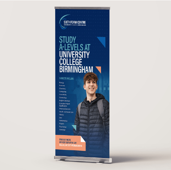
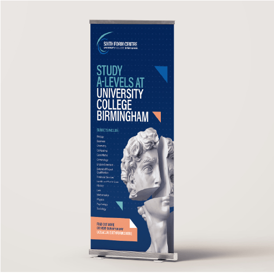
At our Birmingham-based creative agency, we specialise in bringing your business to life through effective and memorable branding, connecting with your audience and helping you to stand out from the competition.

Want to ensure your logo is fresh and on-trend? Our talented graphic designers have outlined some of the most popular trends when it comes to logo design and branding.

Have you ever heard the phrase less is more? Well, a minimalistic aesthetic is exactly that. It focuses on simplicity by stripping away unnecessary components to make the logo both easier to recognise and more memorable.

Think about well-established brands such as Nike, Pepsi, or Mastercard- you can easily remember each of these logos purely because of their simplicity. In fact, Nike has removed more and more elements from its logo over the years to the point that it is now just the iconic swoosh. Learn more about Nike’s brand evolution in our blog!

Logos with minimalistic elements are often the perfect choice for organisations that use multiple communication channels both online and offline.

This is largely due to having less elements to factor into content but is also because they are easily to turn into dynamic logos which transform depending on the environment they are used in.

This helps satisfy the user experience, especially when viewing on digital devices such as smartphones and tablets where content is often resized to fit the smaller screens.

THE INCLUSION OF COLOUR GRADING

A gradient is a design element that enables colours to fade into one another, and they are often implemented into logo designs to leave a lasting impression.

Our eyes are acclimatised to seeing gradients in our everyday lives. A common example is when we look at nature, whether it be a sunset, open water, or a clear sky.

When used in logos, a gradient often implies a 3D effect, which can bring the design to life. This is why they are a popular option for businesses looking to engage with people across both digital channels and print.

Instagram is possibly the most well-known example of a good use of a gradient. It has become of one the brand’s most recognisable elements. Discover more about the meaning behind Instagram’s logo evolution on their website.

The main consideration with gradients is to ensure that your chosen colours are close to each other as they blend more naturally with a complementary palette, providing a smoother transition, rather than having a random combination that can look messy, distracting, and unappealing.

It is also crucial to make sure that your colours display how you intend across print and online. This can be done by comparing your RGB, HEX, CMYK and PMS colour codes.

RGB and HEX are for use on screen, whilst CMYK and PMS are used for print. Colours often don’t display as vibrant when they are printed or can even look like a different colour, which is why you should check how these work across your various marketing channels.

USING LOWER TYPOGRAPHY IN LOGOS

There is something unusual about seeing a lowercase logo because it is expected for them to be capitalised. However, they are a lot more common than you might think!

Currently, around 55% of logos use text that is fully capitalised, but that number is falling, thanks to global organisations including Facebook, Airbnb, and Amazon, who have all utilised lowercase text on their logo in recent years, prompting others to do the same.

Lowercase typography can give off an approachable and friendly vibe, which is why there have been so many larger corporations and businesses moving away from capital letters so that they can appear more friendly and human.

This approach isn’t suitable for every industry, however, with those looking to maintain a professional appearance, such as law firms and other B2B companies, likely to avoid the idea.

Using all lowercase logos is also an effective way to avoid the awkward empty spaces that some capital letters create. Take the letter ‘L’ for instance, which can create a lot of empty space, yet ‘l’ removes that problem.

It’s a trend that has looked like it was here to stay. However, in recent weeks Pepsi have broken the pattern with a brand refresh that has brought back the bold upper-case lettering they previously used. Could we be about to see a change in approach from more businesses?
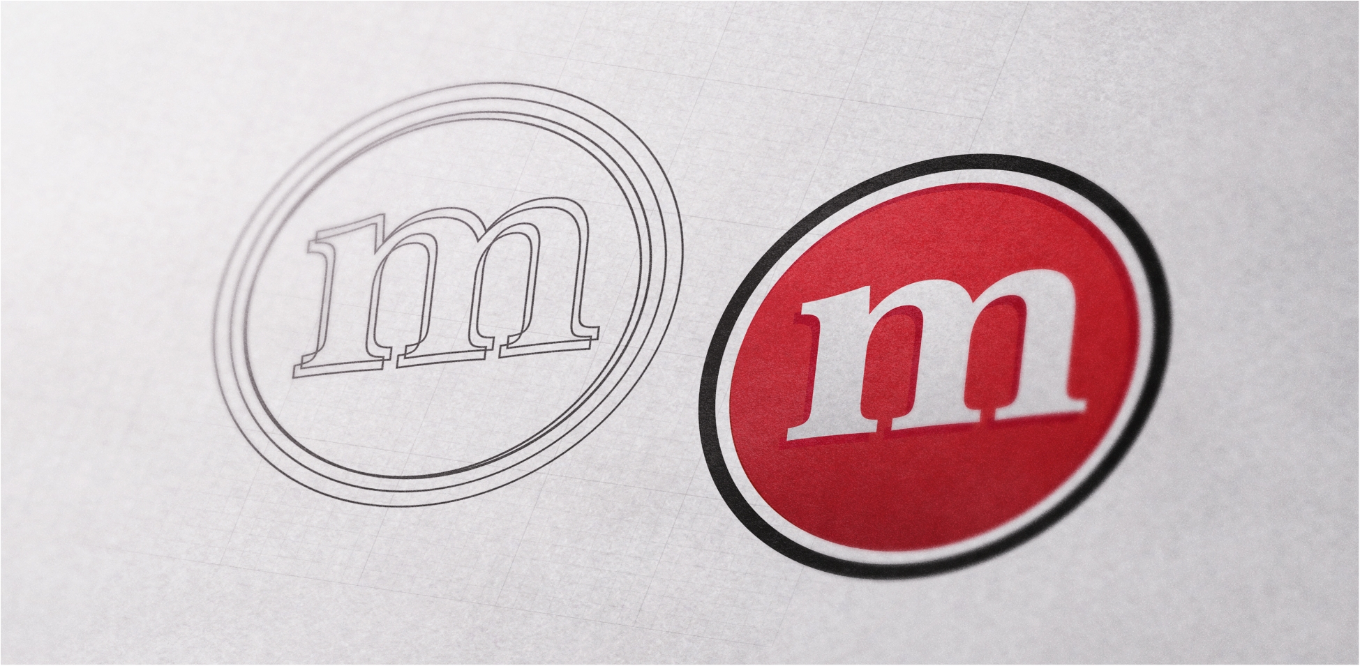
A hand-drawn or sketched logo is a great way to create a unique piece of design work that gives off a personable approach. Famous examples of these types of logos include Disney, Virgin, and Coca-Cola.

This is a particular favourite trend of ours as it gives us an opportunity to showcase our creativity.

Hand-drawn logos are an effective and memorable way for a brand to capture, highlight or emphasize aspects of their brand that couldn’t otherwise be captured with a standard typeface. In some cases, a business will need to be able to communicate more about its message.

The drawback of a unique hand-drawn logo is that it can sometimes be difficult to reproduce or resize across multiple marketing channels if it has complex elements to it. For example, reducing the size for social media or business cards. They may also become expensive to reproduce for printed materials if they feature multiple colours.

ELEVATE YOUR BRAND WITH THE HELP OF THE EXPERTS AT OUR DESIGN AGENCY

If you are looking for a branding company in Birmingham that can help your business stand out from your competitors, you’ve come to the right place.

At EDGE Creative, we have been helping businesses of all shapes and sizes from a wide variety of industries develop their brand and create a memorable identity that sticks in the mind of their audience.

We are currently running a limited time offer where you can receive a free brand audit for your business worth £750.

Our experts will review your brand and help you identify how well your brand and communication compares to your competitors.

Take the first step by getting in touch with us today!

Creating the Perfect Presentation

Firstly, a few aspects are essential to keep in mind when planning out your pitch. Putting well-designed content high on the list allows you to think about conceptual thinking, presentation, and user experience. Design and content are important for getting your message across in a concise, clear way. As part of this process, it’s a good idea to plan out the structure of your content, remember to keep it simple and only summarise key points.

A well-designed presentation is a powerful tool. It can give your presentation personality and can demonstrate a level of creative and conceptual thinking that reflects the way you approach businesses. Attention to design is paramount for any presentation! We would recommend taking a design-led approach, using it as a visual tool to boost your pitch.

If you want to use the presentation as an aid, you don’t want to display too much information. Only highlight the essentials, simplify it to numbers and keywords. When you give your presentation, you want it to be engaging and interactive, so you might consider having a quiz at the end of your presentation and offering a prize if it fits your brand and pitch.

This might be obvious advice, but remember to be prepared, practice your presentation in front of someone, talk it through aloud and think about any questions you might get asked at the end of your pitch.

To accompany the presentation, you might want to think about a handout of the presentation with your contact details you could give out after so that your audience can follow up with you or find out more.

HERE ARE SOME DESIGN TOP TIPS

  1. Ensure your presentation reflects your brand, design, and message.
  2. From a design perspective, you could use your main branding colour to add a touch of personality.
  3. When planning your presentation, consider that your audience doesn’t have much time, so you want to get your message across quickly and effectively, without taking anything away from the purpose of the presentation.
  4. For example, you can accentuate numbers with charts.
  5. Add personality to posts by using icons to reduce and simplify the text.
  6. Icons can work like headings or subheadings. They allow your audience to scan content for the key points.
  7. Use compelling imagery, whether they are stock images or your own. Using bold, striking imagery can add personality and establish your brand. The other benefit to using imagery is that it can break up the text.

Top tip of the day: if you’re sending your presentation out, save it as a PDF so that the formatting, fonts, and imagery remain intact.

If you’d like us to plan, design, copywrite and create a presentation, talk to one of the team today for more information. Call 0121 355 8092 or email info@edge-creative.com.

Why Print is Still an Essential Part of Your Marketing!

In a world that is all about digital, you might be thinking, Is print crucial to reach my audience? The answer is yes. For example, if you want people to find you, you’ll need a sign outside the premises, along with menus, flyers, promotional brochures, etc. Print is all around, and you might not know it.

So, here’s a list of reasons why print is crucial:

1. BRANDING 101

Does your brand stand out? Are you getting your name out there? These are the types of questions you need to ask yourself about your brand.

People are more likely to go with a brand they recognise, and one of the only ways to get your brand recognised physically is to put it out there into the public domain. This can be done with posters, mugs, flyers, billboards, signs, print advertising, etc.

2. IS YOUR BRAND RECOGNISABLE?

The next hurdle is getting your brand seen and recognised. This can be achieved through having a set of brand colours, typefaces, and a logo. Having these elements in place means your brand flows from offline to online seamlessly.

Consistency is the key to a brand’s success. As part of being seen, you need to ensure that the little things are correct. For example, if your poster is getting printed, you need to ensure it is printed to the right size, that it’s legible for the public to understand and that it has been proofread. Attention to detail is paramount, especially as once something is printed, mistakes can be costly.

3. CREATING ENGAGEMENT

With any marketing, the primary goal is engagement. With print being a trusted form of marketing, this may be easier to obtain. To gain engagement through print, you need to keep in mind the following factors: your printed material needs to be attention-grabbing, it needs to represent your brand effortlessly, and it needs to be valuable to the target audience.

4. REACHING THE RIGHT SEGMENTS

With print, you can reach the right marketing segment by simply knowing where your audience is. Taking the time to understand your audience can help you to reach them effectively with targeted print marketing.

5. REACHING OUT TO YOUR AUDIENCE

Niche marketing can be difficult, as you are not marketing to the masses, and you need to make your content valuable, so your audience will pay attention. In addition to this, you need to find out where your product or service will work, what your competitors are doing and where they are advertising, to gauge the best way to get your message out on the right channels.

It’s important to get your brand out there on as many channels as possible. Print allows you to get your message heard offline and create synergy with your online marketing activity.

If you’d like to find out more about how print marketing can help your brand reach new heights, get in touch with one of the team today at info@edge-creative.com.

Love Your Logo – 5 Golden Rules for Creating a Great Logo

A logo is one of the most important considerations for any brand; it functions not only as an easy way for people to identify brands, but it also dictates how brands will be perceived and remembered. Consumers will decide on your brand within literally the blink of an eye.  To make sure your logo is making the right impression, just follow these 5 simple steps.

nike logoSimplicity – KISS – Keep it simple, stupid! Simplicity is a staple for logo development. Simple logos allow for easy recognition, and they also allow for the logo to be memorable as well as versatile. Don’t underestimate the complexity in designing a simple and effective logo; Facebook spent over 250 design hours developing the “Like” icon. A perfect example of a simple logo is Nike with their timeless swoosh:

apple logoMemorable – What is the point of a logo if it’s not memorable? This is one of the most important considerations when designing a logo; after all, you need customers to remember who you are for them to buy from you. An effective logo will utilise the simplicity principle to become memorable. If the name of the brand can be communicated effectively within the logo, this allows for optimum brand retention. This trick is cleverly executed by one of the biggest names out there, Apple:

Coca Cola logoTimeless – A true testament to a great logo is whether it stands the test of time. A great example of this is the Coca-Cola logo, standing strong since 1885 to the present day without so much of a tweak. It’s always tempting for a start-up or a brand refresh to deliver a logo that is ultra current without a great deal of thought for longevity.  It’s vital to consider longevity during the logo design process if you’re looking for long-term success.

Different logo stylesVersatile – When designing a logo, there are many things to be considered, one of these is how your logo will look when the size is altered and when it appears on different platforms. Logos no longer just appear on shop fronts or products, they now appear on computers, tablets and even mobile screens, creating a need for them to become smaller and smaller. An effective logo should be designed with many media in mind. Depending on where or on what the logo is displayed, it can be shown in full with a brand name on a billboard or scaled right down to just a small logo on the phone in your hand.

Barclays logoAppropriate – Another temptation when designing a logo is to make it so that it appeals to many audiences; however, brands with focused logos tend to see more success in both the short and long term. Using your logo as a tool for your target audience to interact with you is key, and choosing colours and styles that resonate with your target audience is a great way to do this effectively.

The world of logo design is a tricky one; getting it right the first time is key, and a one-size-fits-all approach no longer works given all the channels available to customers. Head to our portfolio to check out some of the logos we’ve worked on.

UCB – Battery Manufacturing Skills Pathway

SUMMARY

University College Birmingham (UCB) is a leading sixth-form and higher education institution offering apprenticeships, technical training, and degree-level courses.

With an industry-focused approach, UCB is expanding through initiatives like the Battery Skills Manufacturing Programme, with its latest venture, the UK’s first accredited course in battery manufacturing, the Battery Manufacturing Skills Pathway (BMSP).

THE TASK

Having previously worked with University College Birmingham on a range of design and print projects, including their sixth form prospectus, we’ve established ourselves as a trusted supplier.

This relationship led to a recommendation to support the Battery Project by developing branding and signage for their new Battery Learning Facility, a core element of the wider Battery Skills Manufacturing Programme.

UCB needed a creative partner to bring their ambitious vision to life through impactful visual communications and on-site branding. Our role was to deliver practical, engaging designs that would enhance the learner experience and reflect the innovative, future-focused nature of the programme.

With a strong understanding of UCB’s style and objectives from previous collaborations, we were well placed to ensure the branding felt consistent, fresh, and aligned with the goals of the Battery Programme.

THE RESULTS

We kicked off the project with a site visit, working closely with the Battery Project Team to assess the space and take accurate measurements. This collaborative planning stage enabled us to design and install 17 custom signs across training stations and key workshop zones.

Each sign was developed with clarity and usability in mind, while staying true to the overall visual identity of the facility.

Our experience in design and print for education was key here, balancing the practical needs of a busy learning environment with bold, effective design.

Alongside the signage, we supported early planning for the next phase of the facility, which includes immersive floor graphics and branded high-vis vests. These additions aim to create a more engaging learning space, reflecting the programme’s emphasis on innovation and sustainability.

To help promote the Battery Programme beyond the facility, we also produced a range of marketing materials, including pull-up banners and A5 flyers tailored to different audiences. As part of our managed print services for educational facilities, we ensured consistent quality, messaging, and delivery throughout.

Our team delivered every element on time without compromising on quality. This project is a great example of how we bring creative concepts to life through strategic planning, hands-on collaboration, and reliable execution.

THE PROJECT PARTNERS

Looks fantastic, great job, in a great time frame, thanks to Laura, Lou and the fitter.

Mark McNally

Managing Director of RAVMAC, University College Birmingham

What we can do for you

Book your free consultation

Are you ready to take your business to the next level? Drive traffic, increase leads and stimulate a positive business impact.

Book Now

Phoenix Consortia

Summary

Phoenix Consortia are building services umbrella company specialising in roofing and cladding. Based out of Aldridge in the West Midlands they serve clients nationwide, working with lots of blue-chip companies.

The Consortia is made up of 5 divisions, Howard Evans Roofing & Cladding, SPV Special Projects, Ivor Parnham Building Services, SPV Energy Management and a dedicated training arm.

Their services not only cover roofing and cladding, energy management, surveys, refurbishments, and much more. Our partnership with Phoenix has lasted many years, and we are proud to be their go-to agency for all their marketing needs.

The Task

Our partnership began when Phoenix Consortia were operating under the name of SPV.

They were looking for a marketing agency to help support their growth. Initially our work was focused around designing case studies, the production of a company brochure and social media management.

After a period of success, SPV asked us to support with a comprehensive rebrand to Phoenix Consortia, which would involve the development of the new identity, creation of a brand-new website and a variety of other marketing elements including case studies, digital flyers and videography.

The Results

Our initial collaboration with SPV was highly successful in helping them achieve their targets. We produced a company brochure, several case studies, email campaigns, and social media posts designed to clearly showcase their expertise in the roofing industry.

The success of these projects, and the subsequent work SPV secured, led to us being chosen to help develop the Phoenix Consortia brand.
We created a strong visual identity for Phoenix Consortia, selecting regal blues, golds, and whites as the brand colours. We designed a phoenix-inspired logo to represent unity and produced comprehensive brand guidelines to ensure consistency across all communications.

To establish their digital presence, we designed a sleek, functional,
and professional website focused on highlighting their expertise and showcasing completed projects. The website provided a platform to unite the five businesses under the Phoenix Consortia brand while detailing individual project contributions.

A key feature of the website was the corporate video we produced. This involved filming on-site at Phoenix Consortia and various client locations, incorporating drone footage to enhance accessibility and offer a dynamic perspective.

Our partnership with Phoenix continues to thrive. We regularly provide design support, creating materials such as case studies, bid documents, and digital flyers. Additionally, we manage their ongoing content needs, including email marketing, videography, and social media content creation, all focused on showcasing the team’s expertise and skills.

I’ve always received a high quality and professional service from everyone I’ve dealt with at EDGE. Amazing creativity and work. They go over and above expectations every time. I would highly recommend them to anyone.

Kate Whatley Commercial Director

What we can do for you

Book your free consultation

Are you ready to take your business to the next level? Drive traffic, increase leads and stimulate a positive business impact.

Book Now

Rebox Homes

Rebox Homes header image of home

Summary

Rebox Homes is a residential building company based in Solihull, focused on smaller-scale, bespoke projects for modern living. They specialise in custom-built homes or flat buildings that maximise unused or available spaces between roads and other buildings.

Rebox utilise top-of-the-range fittings and furniture to create functional and beautiful living and communal spaces for families, young professionals, and more.

Rebox were referred to EDGE Creative by Smart Homes, an estate agent and fellow client of ours also based in south Birmingham. The team at Rebox Homes were impressed by our previous work and wanted to discuss the possibility of helping them on their marketing journey.

The Task

Rebox Homes first approached us to help them create and establish a solid brand identity, which is one of the most crucial aspects of marketing a business. This new branding would then be used as the theming for a new website, company signage, and other marketing materials.

Prior to starting any specific design work for Rebox, we held several exploratory meetings with the client to discuss their vision, some of our early concepts, and the ultimate goals of the rebrand. These important talks were able to guide our first few design and branding choices, allowing us to focus in on the Rebox team’s own vision and start on the right foot from the very beginning.

Mobile web design for Rebox Homes
home realtor banner design for apartments
Branded brochure design for Rebox Homes
Website design on pc for Smart Homes

The Results

For this project, we needed to utilise our extensive experience in branding work and the property market. Having previously worked alongside both estate agents and building companies, we were confident in our ability to create something Rebox Homes would love.

After presenting several different branding options to the team that each matched the ambitions and visions of the company, they chose the sleek and modern style they use today. This included regal brand colours, like dark blue and gold, and a minimalistic yet symbolic logo that is perfect for signage, business cards, and other advertisements.

While creating these branding options, our development team started to build a new website based on the needs of the client. A wireframe and much of the copy was completed early using our knowledge of their target audience, and once their branding choice was made, it could simply be added in.

Then we got to work designing brand new eye-catching hoardings to be put up around their work sites, advertising the business to any foot traffic in and around the area.

Now, Rebox Homes has a bespoke website, advertising material, and distinct brand voice to tie it all together that reflect the quality of the work they produce.

What we can do for you

Book your free consultation

Are you ready to take your business to the next level? Drive traffic, increase leads and stimulate a positive business impact.

Book Now

University College Birmingham

UCB booklet design

Summary

University College Birmingham, is a higher education centre providing apprenticeships and A-levels alongside undergraduate and postgraduate degree courses. The university college is comprised of four schools, each delivering courses to students of all levels, with world-class facilities.

EDGE Creative and University College Birmingham have had an ongoing partnership for more than eight years. Due to this longstanding relationship, as well as the effectiveness of our past work with the university and thorough knowledge of their existing brand, we were successful in our pitch to create a brand for their new sixth for centre.

The Task

University College Birmingham were looking for a creative agency to deliver a new brand for their purpose-built sixth form centre opening in September 2024. The multi-million-pound development, located in Birmingham city centre, will offer a range of A-level and vocational courses utilising university facilities including hi-tech labs and simulation health wards.

The idea behind this new facility is to provide college-age students with an academic route into University College Birmingham, giving them the opportunity to “prepare for university at university” – a theme that is central to the brand and marketing materials used for this project. Therefore, it was key for us to show that the new sixth form centre is a part of the wider University College Birmingham brand, but also that it had its own unique benefits and audience.

In completing this branding project, we also designed their prospectus and social graphics for the new facility, ensuring that the brand remained consistent throughout all marketing channels.

UCB Sixth Form Logo design
UCB Sixth Form designed booklet in print
UCB sixth form banner design
Poster and booklet design and branding for UCB

The Results

Since we already had an established relationship with the university, we were familiar with their existing branding choices and made sure that any new materials followed a similar theme.

The first stage of this project was to work closely with the University College Birmingham team to develop a range of design concepts that fit what they were looking for, and then support them with narrowing their choice down to one concept. We then took the time to perfect the chosen design concept and produce the materials needed using that design philosophy.

We achieved consistency with the wider university brand by utilising the existing brand colours and imagery, but combined it with fresh copy targeted at academics, utilising the “prepare for university at university” slogan.

We produced the final designs for a 40-page prospectus covering the courses, facilities, and more offered by the sixth form centre. We also provided the designs for several social media graphics that were used as part of a comprehensive social campaign announcing the development.

We are truly thrilled with the brand concepts EDGE has developed for us. EDGE have been very easy to work with, very flexible and accommodating, which is an essential quality in an agency when you’re working on a new project.

Their creative flair and deep understanding of our brand, requirements and aims has led to the creation of something we’re excited to showcase.

Alma Aganovic Marketing and Admissions Director at University College Birmingham

What we can do for you

Book your free consultation

Are you ready to take your business to the next level? Drive traffic, increase leads and stimulate a positive business impact.

Book Now

Maverick TV

Summary

Founded in 1994, Maverick TV is an award-winning UK-based television production company that specialises in reality tv shows, documentaries and entertainment formats for broadcasters across the globe. They are considered one of the leading TV production companies and have produced many of the UK’s most popular tv shows including ‘Embarrassing Bodies’, ‘How to Look Good Naked’ and ‘Fifth Gear’.

The Task

We were tasked with refreshing Maverick’s branding and stationery. Being a large brand who are well-known to their audience, they wanted the brand refresh to be sympathetic towards their icon and brand colour so that it was still recognisable to their audience.

The brand colour was a particularly important part of Maverick’s history and was unique to them and we needed to manage this for brand consistency.

Along the way, we created several different design adaptations for Maverick to choose from. To involve the client throughout the journey we presented the refresh in several stages, starting with sketches and line drawings and finally moving on to full colour and stationery mockups to see what the execution would look like.

We had to consider the logo from many aspects as it would be animated for the TV end credits, printed for stationery and other marketing, and needed to work on many different scales.

Maverick was also looking for a fresh approach to the digital website banners used to promote their popular shows including The Gadget Show, Embarrassing Bodies and Fifth Gear, that connected with their audience but also complimented their desired new brand refresh.

The Results

Maverick chose to work with us because of our specialist knowledge and precision in colour management in regard to spot colour, full colour and digital which came in as we balanced the colour depending on the medium.

We utilised the expertise of our talented design team to ensure that we refreshed their brand identity in a way that met their requirements and transferred to both print and digital formats.

We understood the importance of maintaining elements of their identity that represented their history and was still recognisable to their existing audience.

The final logo selected by Maverick was chosen because it was versatile and encapsulated their brand values. Our success in getting the logo right for the client led to new stationery, business cards and digital website banners Maverick used to promote its most popular shows.

Our excellent management of the project also meant we were Maverick’s chosen supplier for their LA office.

What we can do for you

Book your free consultation

Are you ready to take your business to the next level? Drive traffic, increase leads and stimulate a positive business impact.

Book Now

The Nations Favourite

The Nations Favourite packaging design, logo design and company branding

Summary

TCR Food Services are a food products supplier based in Birmingham. They work with some of the country’s biggest manufacturers to supply over 650 take-away outlets across the UK, providing excellent quality food products and packaging from a range that’s constantly expanding.

On a mission to add further value to the takeaways they supply, TCR came to us with a desire to create a brand for their extensive range of packaging, incorporating an identity that appealed to takeaway customers across the nation.

The Task

EDGE were tasked with overhauling the design of TCR’s entire range of packaging. After bringing design, copywriting and account management teams together to share ideas, we presented TCR with “The Nation’s Favourite”: an identity that pays homage to the fishermen that brought chip shops to life, the British sea sides that form so many memories and the nostalgia that comes with it all.

Food packaging design for The Nations Favourite
Food advertising design for The Nations Favourite
Menu design and menu branding for The Nations Favourite
Food packaging, product packaging and product branding for The Nations Favourite

The Results

We rolled this concept throughout each design, incorporating seaside imagery such as lighthouses, boats, waves and ropes as well as crafting a sentimental story to evoke relatable memories of rainy seaside holidays and the quintessentially British comfort of a bag of fish and chips on a Friday night. Our work led to a positive outcome for the client, who delighted customers with the new range.

What we can do for you

Book your free consultation

Are you ready to take your business to the next level? Drive traffic, increase leads and stimulate a positive business impact.

Book Now

Link Engineering

Summary

Founded in 2019, Link Engineering specialises in Civil and Structural Engineering. Based in Birmingham, they offer a variety of services from building investigation to planning support and civil & structural engineering design, demonstrating their extensive experience in a wide range of projects. Through using modern proactive design and technical expertise, they will provide you with consistent and cost-effective solutions.

The Task

When Link Engineering was looking for a digital marketing company, they wanted somewhere that was local to them. After connecting with us in January 2021, we were tasked with designing and producing business stationery such as a new credential document, business cards, animated email signatures and brand guidelines. Furthermore, Link Engineering were looking to create a new website that took them from a start-up to a well-established business.

The team got to work to create bespoke and authentic designs for their stationery that incorporated and amplified their existing unique brand identity. Once the general look and feel had been established, we carried these through to the website designs.

The Results

Our team worked tirelessly to produce a stunning website that matches Link Engineering’s ambitions of becoming the leader in the structural and civil engineering industry.

We are thrilled with the final product, which you can see here. We’d like to give a special shout out to our Designer James, Website Developer Alex and Andrew for their unique logos and animations!


We feel we now have a brand that is representative of our business as a result of EDGE’s input. EDGE have warmly welcomed us into their networking events and leadership discussions; it really feels like we are part of their community.  A special mention must go to our Account Manager Kelly, who has been responsive, flexible and understanding at every step. We are looking forward to continuing to work with EDGE as our business grows further.

Jessica Moore Operations Manager at Link Engineering

What we can do for you

Book your free consultation

Are you ready to take your business to the next level? Drive traffic, increase leads and stimulate a positive business impact.

Book Now